Branding local artisan charm with rock rebellion.
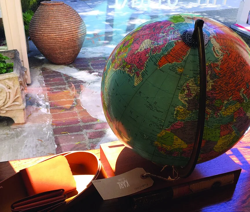
Karl the Store is a warm, eclectic oasis in the chilly fog of San Francisco. A mix of contemporary and vintage furniture, home goods, jewelry, clothing, art, Karl is an instant cult classic, seeing shoppers in the likes of tech CEO’s, artists, tourists, and world famous actors, on any given day.
The brand identity needed to be anchored in mid-century modern design, while being current enough for their contemporary works.
The logotype was developed using the mathematical geometry of the Golden Gate bridge-to-Bay relationship.
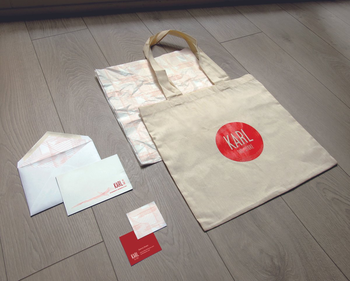
Abstracted landscape and topographic forms lead to a graphic vocabulary and custom Karl Weave textile print for use on collateral.


Client: Karl, the Store
Location: Boutique retail environment, multiple locations: San Francisco, CA, USA + Sausalito, CA, USA
Season: 2018
Role: Concept & Creative Director, brand identity, packaging design, surface design
Format: Brand identity including business suite collateral, packaging, store signage, shipping & gifting materials
With such rich mid-century modern inspiration, the design nods to a bygone era while staying fresh.
Calling on the colours of the Bay Area, vibrant warm red meets cool, foggy blue, extending into a quirky, mid-century extended palette.


